This past few months, I’ve been learning more about typography, particularly about type design for the covers of digital books. Theoretically, book covers should be the same independent of format – in reality, we look at digital book covers differently, which places different demands on the design. Specifically, when we shop online (whether we’re shopping for print books or digital books) we tend to look at thumbnail images of the book covers. This means that covers need to communicate more detail quickly and clearly. The author name and title need to be bigger, so they’re legible in that small size, and it’s best if the background or image is simpler. On the other hand, a simple image can look cheap when it’s bigger on a print edition. So, the ideal is to find a balance in which the thumbnail version does its job, while the detail in the full cover makes the full size image work. Some people are actually doing different covers for different editions of their books, to address these different issues.
I really like the illustrations Eithne has created for my books, particularly those of “the girls” on the Bride Quest II covers and also Murdoch on THE RENEGADE’S HEART. After all I’d learned, though, I wanted to have the type redone on these covers.
When working with traditional publishers, artists don’t often do the type. They create the background image, then the publishing house (well, someone in the art department) does the type for the cover. Eithne works this way, and although she has done type for me, it’s not her favorite job. I have a hard time articulating what I want the type to look like, so we spend a lot of time getting to wherever we end up.
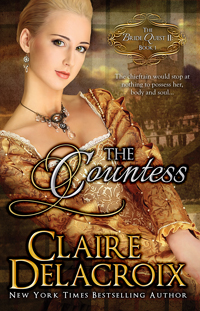
So, when I was down at the Novelists’ Inc. conference in October, I had a chat with Kim Killion about revising the type on some of my digital book covers. (Kim did three of my time travel romance covers, the Jewels of Kinfairlie covers, and the Coxwell covers.) She’s now taken the illustrations done by Eithne for these four books (with Eithne’s blessing) and given them jazzy new type. I think Kim has done a fabulous job of bridging the demands of both formats – the type is clear in thumbnail size, but the larger images for the print editions have lots of rich detail.
The new covers have been uploaded to Amazon and to Smashwords. I still have to upload them to some other portals, and it will take time for them to perk out into the world from Smashwords. I’m hoping everything will be updated by the new year, but in the meantime, let’s have a peek.
First, the new Bride Quest II covers.
THE COUNTESS:
 THE BEAUTY:
 And THE TEMPTRESS:
And here’s THE RENEGADE’S HEART:


